Global networking for Detectorists.

Branding and marketing for niche social media app, Detector Network.

Detector Network set out to launch a full-featured social app for the global metal detecting community. With no established competitors to reference and a feature set that rivalled mainstream platforms, the challenge was to design a brand and user interface that felt instantly familiar while standing out within a highly specific niche.

We were brought in from the beginning to shape the identity and design system from the ground up. The goal was to help Detector Network grow its user base by delivering a polished and intuitive experience that looked and felt like a product people already knew how to use.

The strategy was to strike a balance between outdoors and digital, reflecting the hands-on nature of the hobby while delivering a platform that felt modern and intuitive. The brand needed to be open and approachable, appealing to seasoned detectorists and newcomers alike.

We built a system that could flex across digital platforms, from in-app design to social media presence, without losing clarity or character. The goal was to make the experience feel familiar, trustworthy and part of a real-world community, while still carrying the polish of a modern tech product.
.

The concept drew from the visual language of mapping and wayfinding, tying into the idea of exploration and discovery that sits at the heart of metal detecting. The black and yellow palette took cues from tech and outdoor gear, creating a look that felt both modern and grounded in the hobby.

Early explorations focused on clarity and versatility. The identity needed to be instantly recognisable at any size, from in-app icons to profile images and beyond, while still feeling distinct within the world of social platforms.

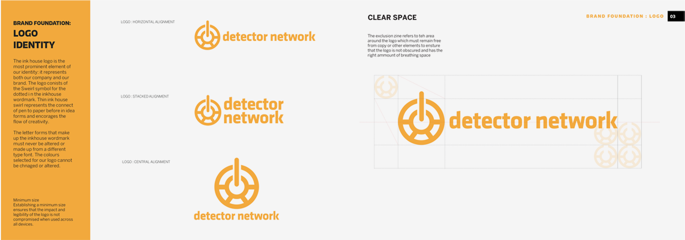
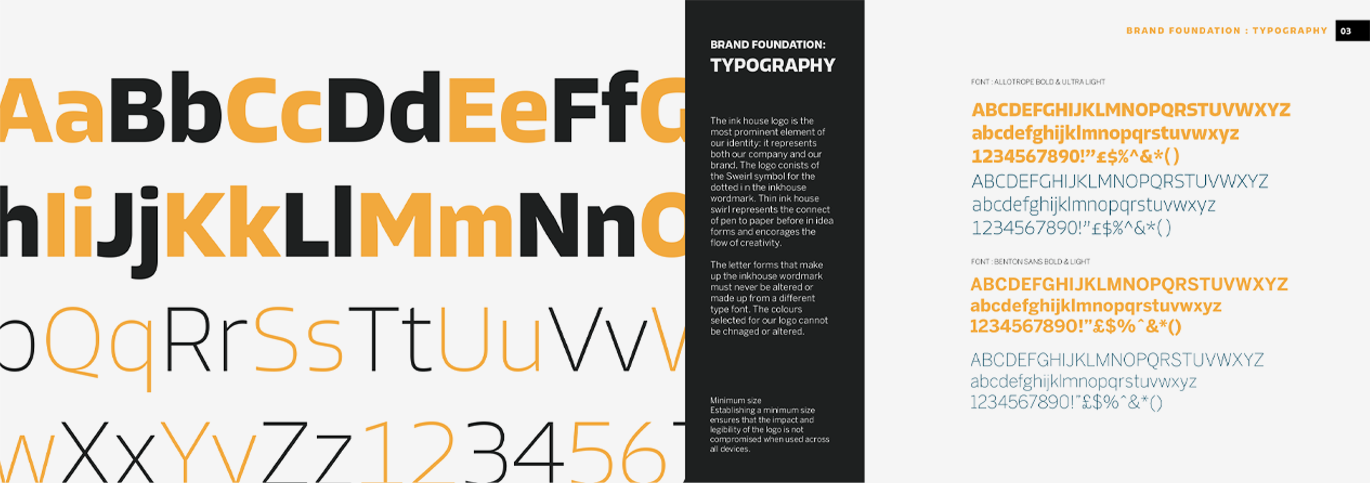
The final identity paired a bold logomark with strong, modern typography, giving Detector Network a distinct and confident presence. The circular icon takes inspiration from both mapping symbols and the coil of a metal detector, subtly hinting at exploration, focus and signal.

A black and yellow colour scheme gave the brand a clean, tech-driven feel while keeping it visually aligned with outdoor gear and safety markings. The design was built to scale smoothly across digital platforms, from in-app use to social media, helping the platform stay recognisable wherever the brand appeared.

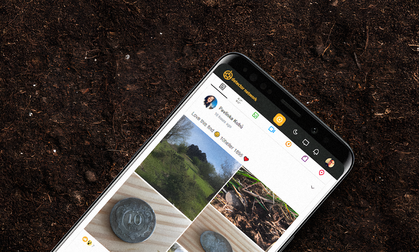
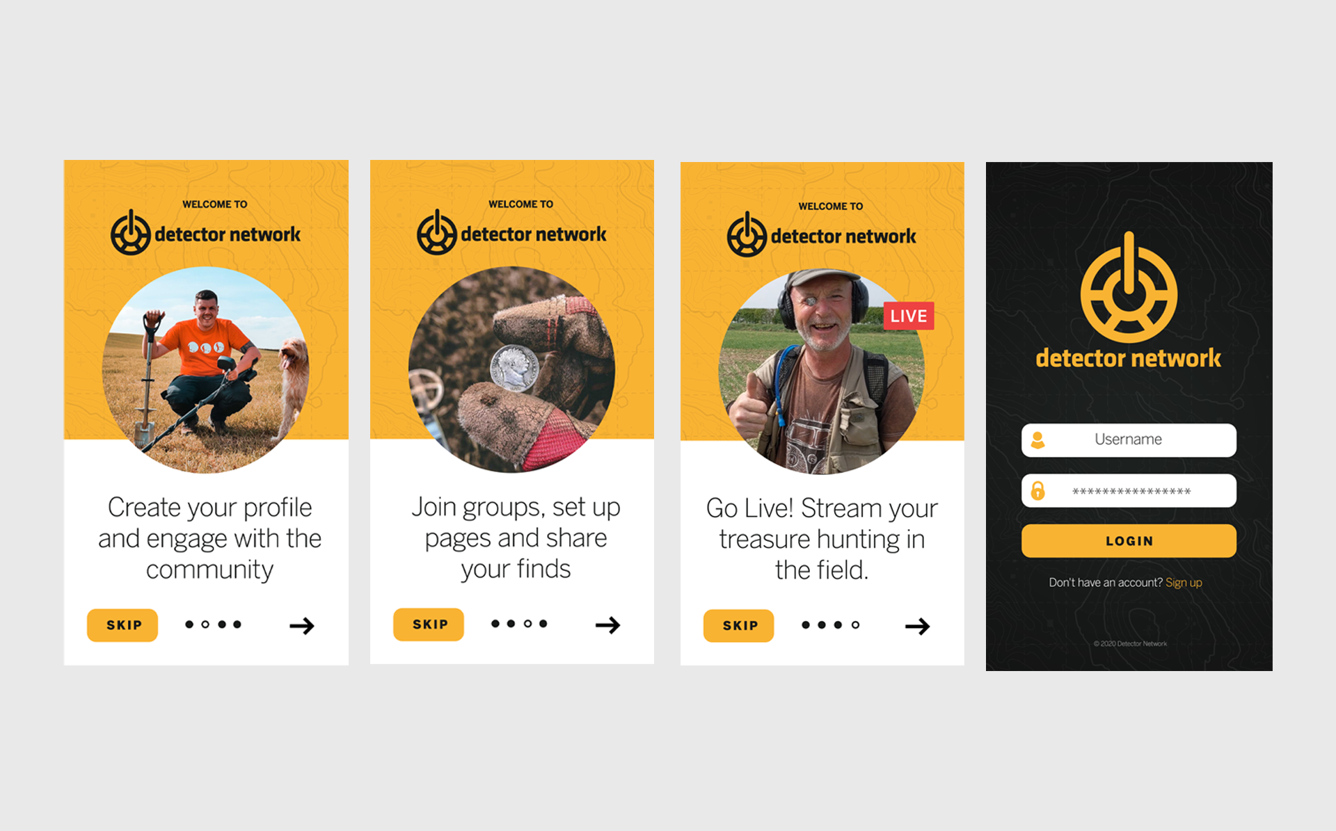
The app was designed to feel instantly familiar, borrowing established UX patterns from mainstream social platforms while staying focused on the needs of a niche audience. Features like a global feed, profile icons, and marketplace tools were all styled to feel clean and intuitive, with a dark mode-inspired UI and bold brand accents throughout.

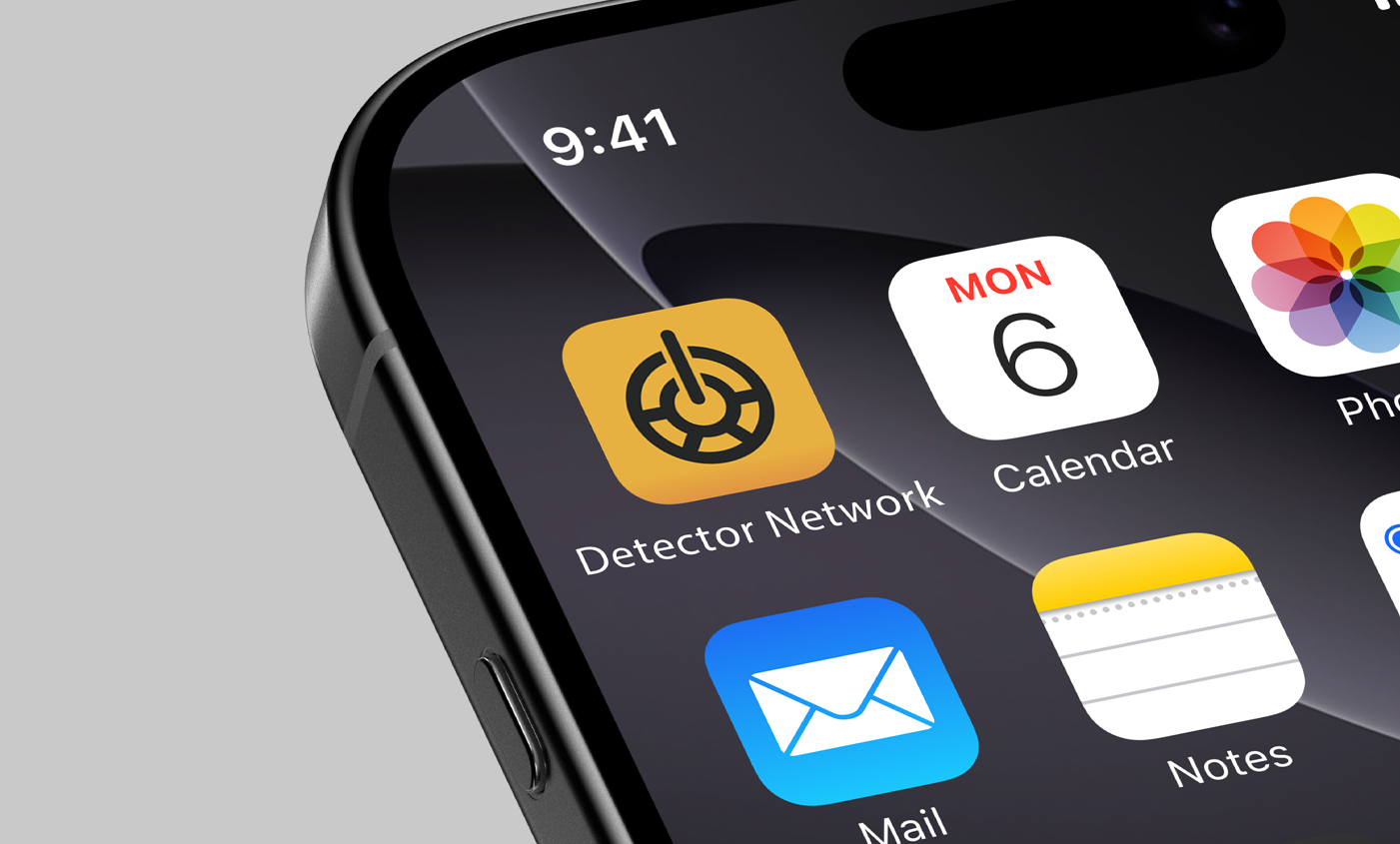
Alongside the product design, we created a suite of launch graphics to promote the app across the App Store, Play Store and social media. These visuals emphasised the brand’s mapping-inspired icon, reinforcing the link between outdoor exploration and digital connection. Every asset worked to position Detector Network as a polished, trustworthy platform made specifically for its community.

Next project

Macmillan Cancer Support

video production